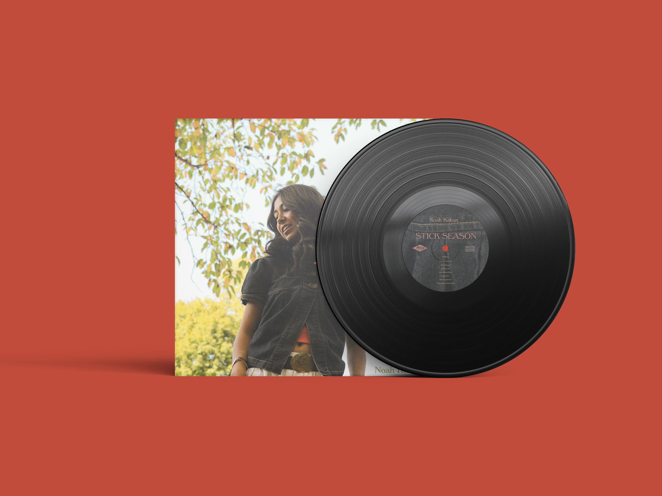
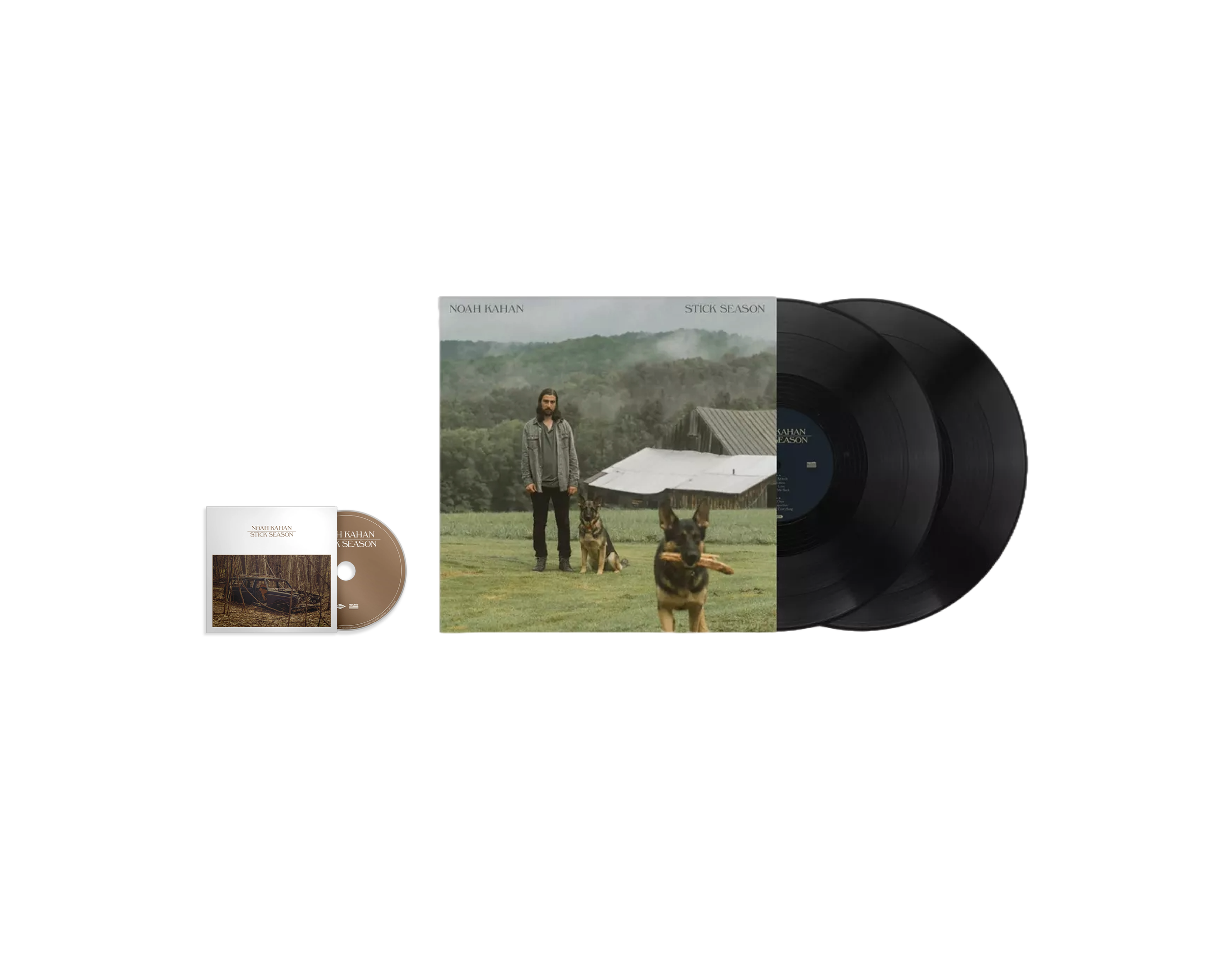
LP Redesign
The intention of this project was to translate music into a visual form using photography and typography. The goal was to design album art that reflects the musician’s message while drawing in listeners. I created two alternate covers for a LP and one for a CD that communicate the same mood in different ways, showing how design can speak the same language through multiple outcomes.

Choosing an Album
I chose Noah Kahan’s Stick Season to redesign. I am very familiar with all the songs and understand his message.

Text Exploration
I explored text from old national parks advertising and other folk/natural inspired fonts
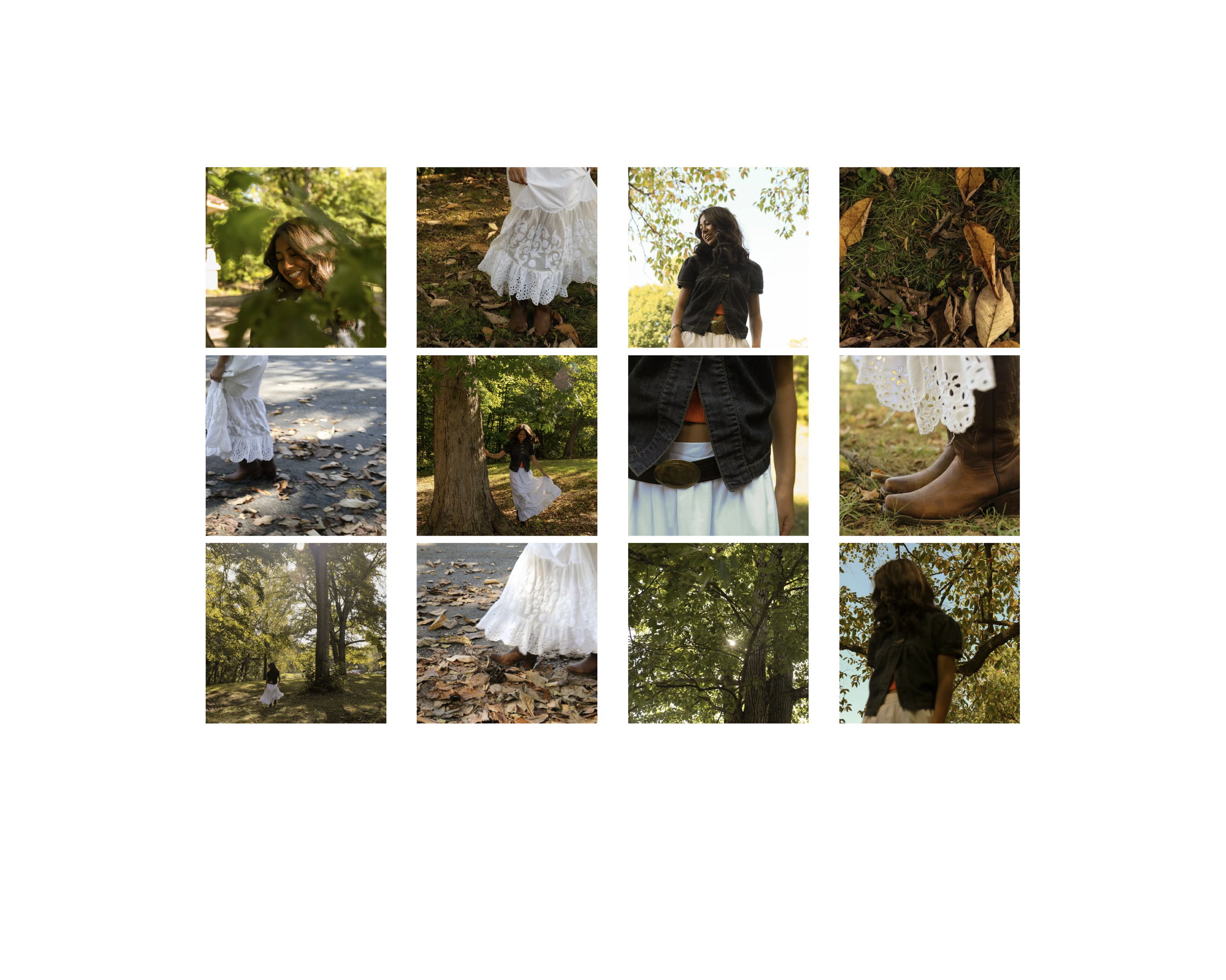
Photoshoot
Some of the images from my photoshoot. Tried to get alot of variety so I had more to chose from.
Ideation
Experimented with different images and my top 2 primary typefaces.
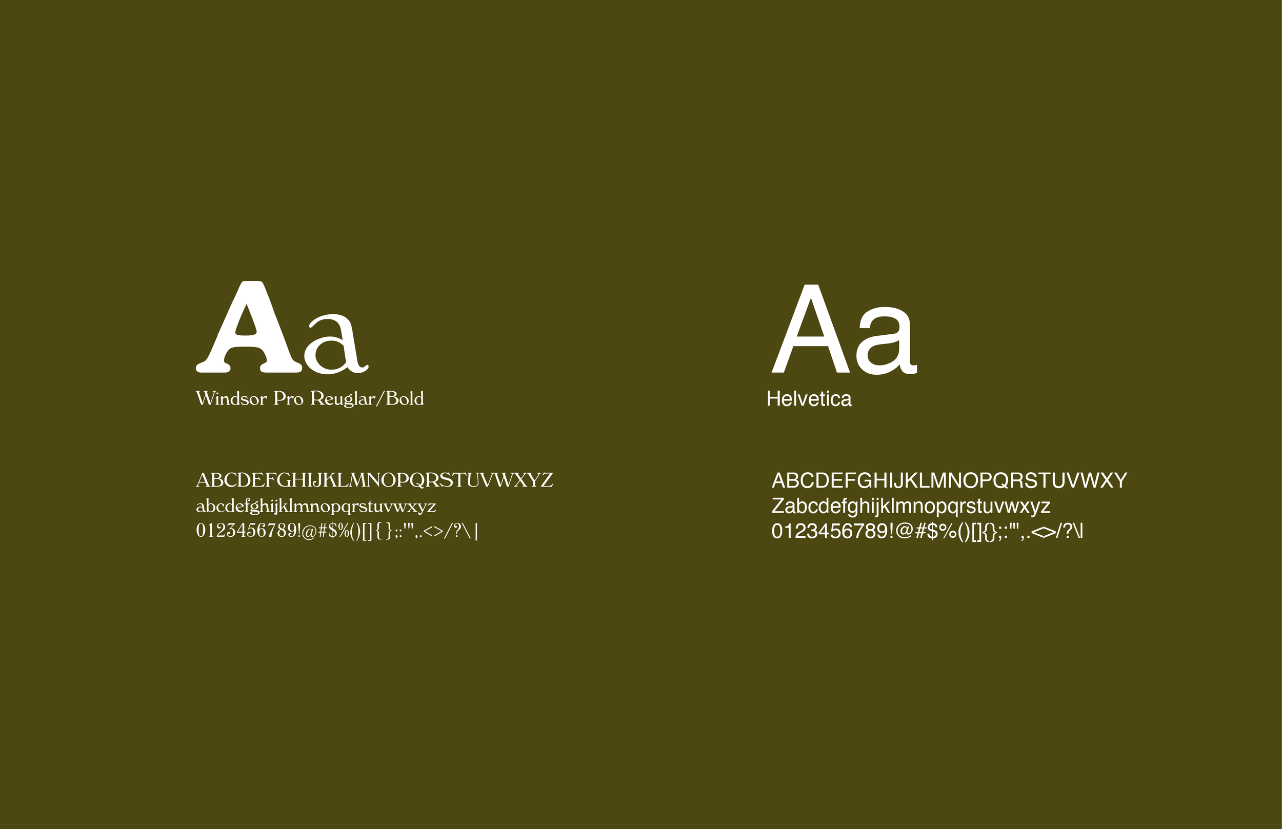
Final Fonts
Windsor Pro is Primary Type, Helvetica is secondary for information such as song titles.

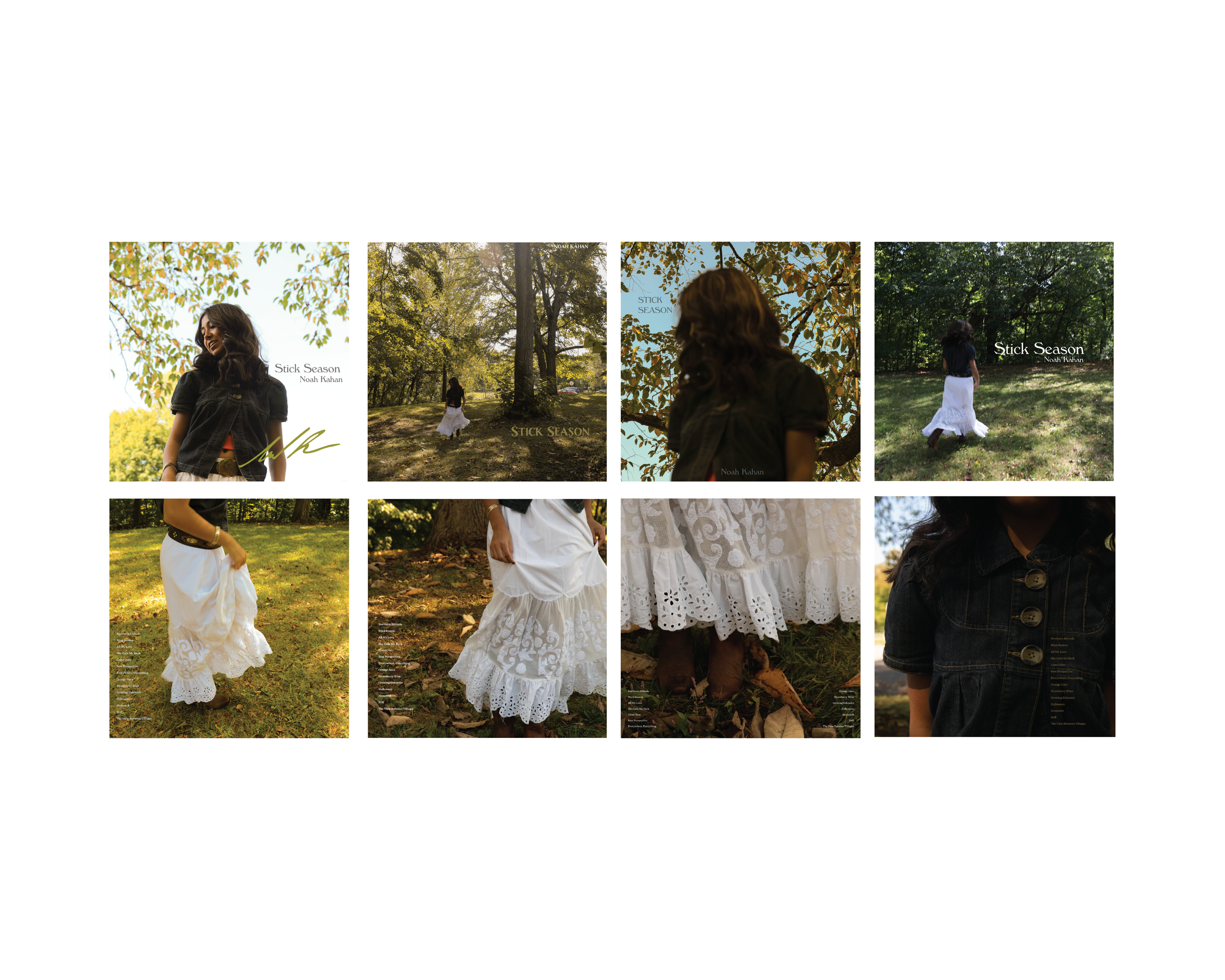
Final Front & Back

Final Side A & B